Art Deco Style Hex Tile: Geometric Flooring Design | DC
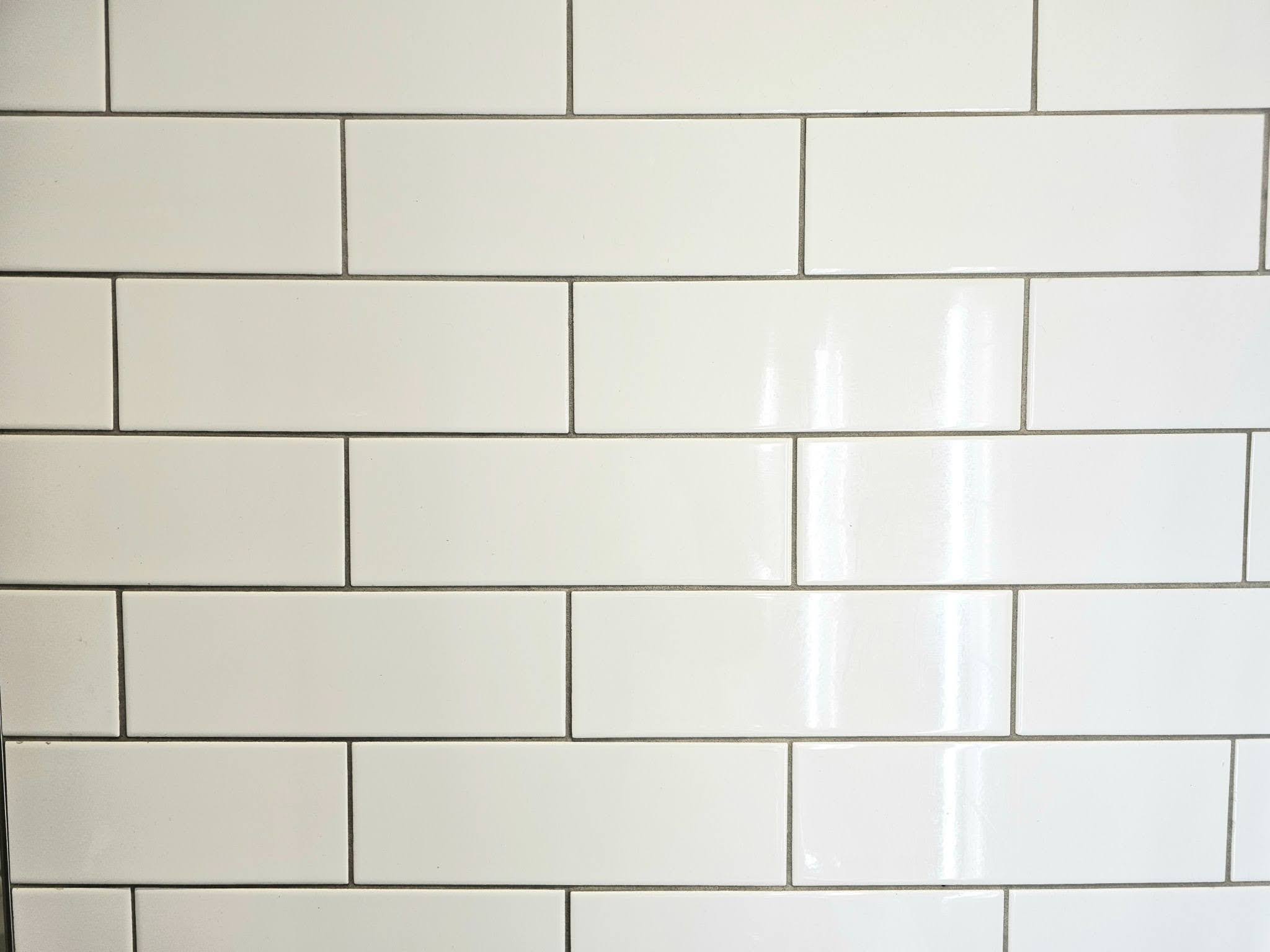
This past week we looked at a really interesting artistic type of porcelain tile. The tile had a design set into the surface of the tile which ran out at the center edge of both sides and the top and the bottom. Essentially, each tile was intended to be set in a square bond and the intended layout wouldn’t really work at all if that particular bond had changed to any other layout.
For example, if you try to set that bond on a running bond or a subway tile bond, the artistic lines in the drawing wouldn’t meet at the edges between one tile to the next. That’s how it was intended to be installed on walls and wasn’t really intended for flooring. Today we’re looking at a tile that’s intended for flooring but has a similar sort of artistic element without the specific drawings.
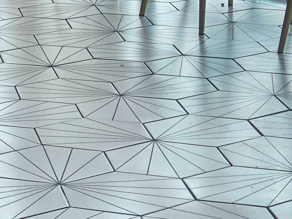
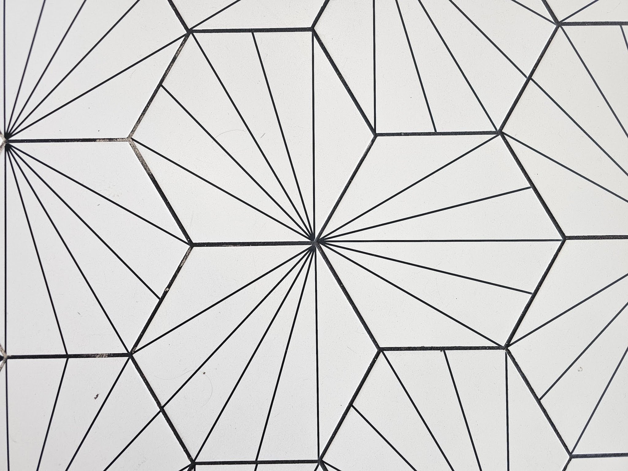
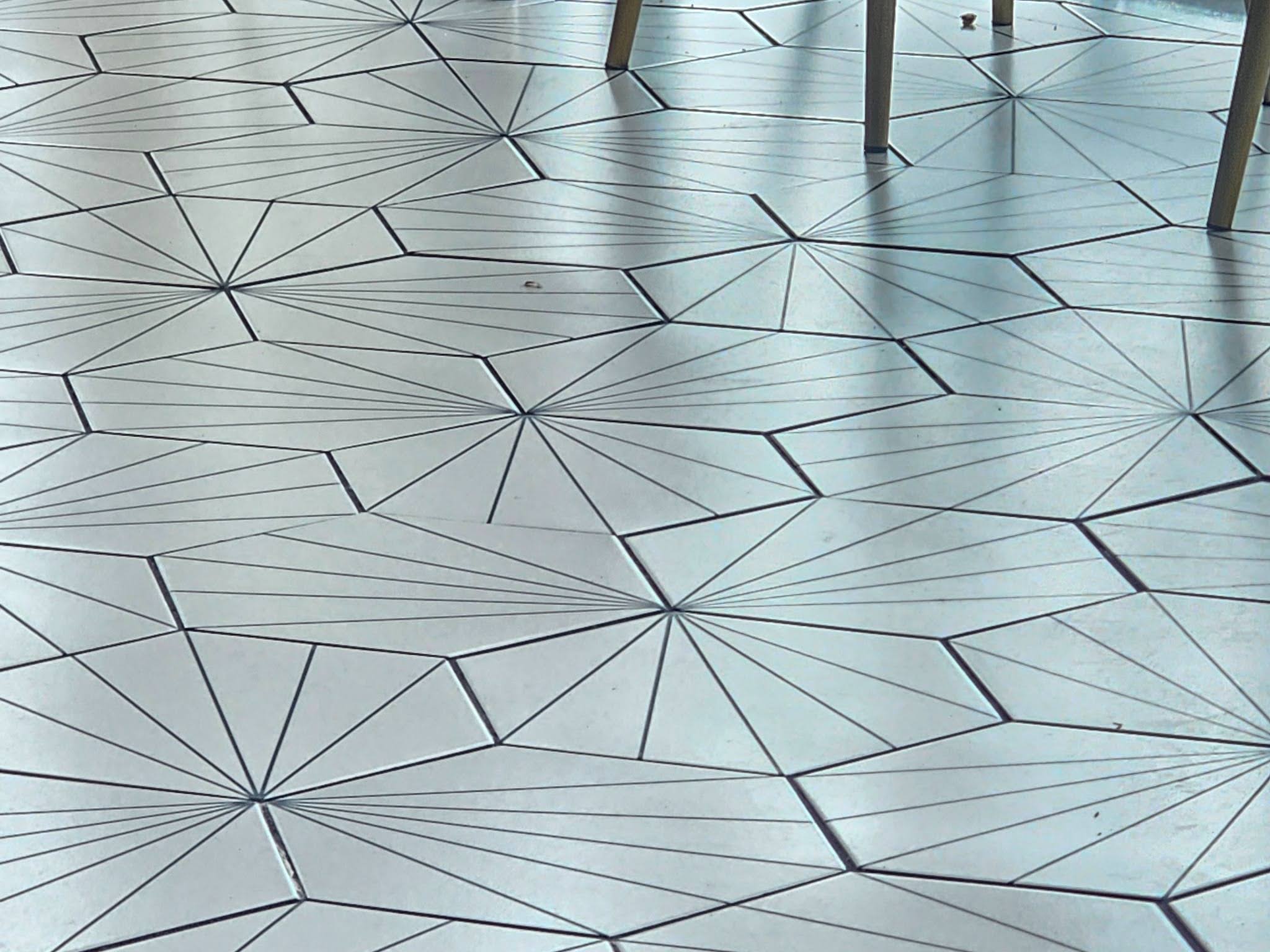
Instead, these hex tiles have five lines that run from one of the six interior corners out to the far edges. When installed in patterns where the vertices meet at the same corner between three different tiles, the pattern can meet up so that the lines intentionally meet each other from one tile to the next. A picture of the overall pattern follows in the next picture below.
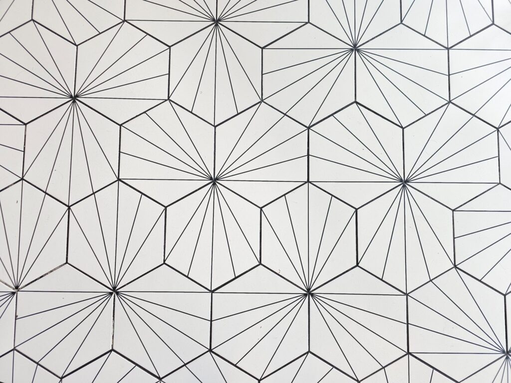
When you look closely at each individual tile, it kind of looks like the design is intended to portray each individual hex tile as if it’s cut into six different tiles. This is really kind of an art deco style element. In the upcoming article, this coming week, we will show some other types of elements that are intended to blend with this style so that it looks a bit like that art deco time period design.
Art Deco style hex tile like this is sometimes referred to as a starburst style. The article deco style is supposed to reflect luxury and riches. You can see elements of symmetry and simple lines in the design, with geometric repetition. (Using design styles to reflect faux riches might sound tacky to some people but it’s arguably much better than painting Washington DC gold.) This particular Art Deco style came after Art Nouveau and it was a bit of a rejection of the Art Nouveau style. Although there are some overlaps and similarities, the Art Deco style was largely a rejection of the preceding style.
It’s almost like the Art Nouveau Style was rejected by designers so extensively that they went back a hundred years in time and started borrowing elements all the way back from the Empire Style of design. There were many cultural connections to these different design styles that unfolded over that hundred year period from the early 1800s to the early 1900s.
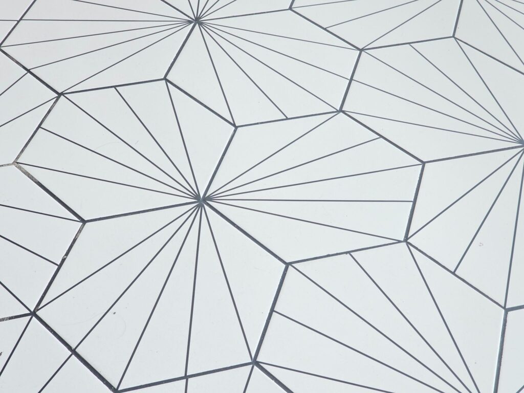
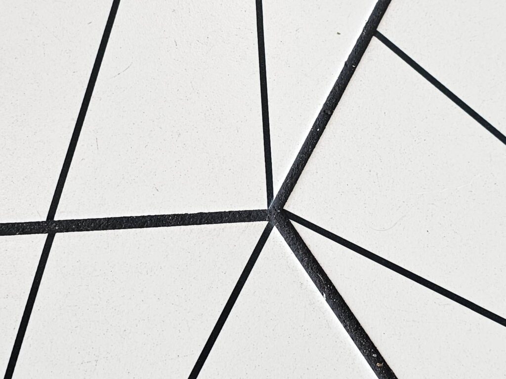
One of our biggest criticisms of this particular installation is that the faux grout line set into each individual’s tiles interior is 1/8 of an inch thick. Yet they used a grout line that was over 3/16 of an inch thick at the perimeter border of each tile when they actually set the tile. We make it a point, when we look at and critique many different installations of tile, to point out that we highly recommend matching the grout color to the darkest elements of color variation within a tile. Here, there isn’t actually much variation between the two distinct colors. black and white.
They are completely opposite and there’s no other colors that are somewhere in the middle of the spectrum. But even within blacks and whites, there are many different shades within the range of each of those two distinct colors. Here, they made their grout line color a smidge lighter than the lines inside the tile itself.
At a glance in the picture below, you might think that the grout line is actually darker, but it isn’t. It’s just wider. From a distance or at a glance, that difference might make it look darker, but when you hone it on the actual pictures on the screen, you’ll see that the lines in the field of the tile itself are actually darker than the grout line.
Generally, grout lines take more dirt and stay dirtier, even with good maintenance, than the elements of the tile itself. It’s important to factor that dirt related future lightening. You don’t have to change plans drastically, but you might want to make your grout line color just one shade darker than you would otherwise, considering that the grout lines generally have a slight recess. That recess is a place that traps dust and dirt. Unless you’re cleaning the floor with a mop and you’re changing your water in your mop many times within each cleaning, there’s bound to be a slightly lightened shadow of dust left on top of each grout line.
In the coming week, we’ll look at some of the same elements from this installation and also talk about some of the additional surrounding interior design elements. These details tie into the Art Deco style but like we mentioned above, have many implications for the other styles and the events around the culture that created those designs.
Dupont Kitchen & Bath Can Help
As dedicated and local DC metropolitan kitchen and bath builders and installers, we pride ourselves on turning your visions into reality. Your kitchen and bathrooms can reflect your unique style and be designed with personalized aesthetics. It can be a process from creative designs to the realization of your dream space. Specializing in kitchen and bath construction, we bring expertise and skills to every project. If you’re contemplating a renovation, upgrade, or modernization in the local market, we’re happy to be your team. Consult with us, and we can start together on a path to redefine and elevate your DC living experience.
You can visit our website to learn more about our kitchen and bath services and explore your renovation options. If you have questions or would like to discuss your project, simply use our convenient online contact form to get in touch with our team.