Black and White Bathroom Vanity Design Ideas – Part II
This past weekend the week before we looked at two different bathrooms that had vanity sinks with no real countertop. Each of them were almost identical even though they were from two totally different buildings. They both had relatively thin strips of a couple inches of space around the perimeter of the sinks. As we mentioned in this past week’s example, you can see a difference between the wall color and the vanity sink top.
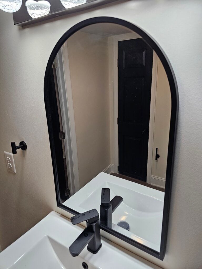
Here, you can see that contrast and the next picture below, as well. The walls are not nearly as bright or white as the vanity sink top. You can also notice they’ve used a really dark color for the doors. This door is almost a black color, similar to the color of the vanity cabinet. We like that they’ve done something a little bit more unique here, but it’s a bit bold.
We’re not used to seeing our clients select really dark accent colors. Particularly where the wall base and other details of the bathroom happen to be bright white instead of just using a total of two main colors in their design styles, here they’ve really got three different colors. There’s an off-white cream or bisque color for the field of the walls and a dark color for the vanity top, mirror accent trims, and the accent paint colors at the door. And then thirdly, there’s this off-white color for the field of walls. Together those three colors don’t necessarily clash, but it’s a little bit less minimalist than you might find in a simpler color scheme.
The next picture below shows a similar but different vanity top and vanity sink. It’s not just a single sink, but instead a pair of sinks set up as a double sink top. We highly recommend bathrooms that are shared between couples or families to have more than one sink. It’s particularly useful during busy times like early mornings.
Households can become a rush especially when they have to leave together to get on to a commute to go off to school or work. It ends up being a bit hectic when everyone’s rushing to get cleaned up and take a shower and get dressed and rush out the door to leave the house in the morning. During those times, especially with large families with kids, you might find that one person is using the sink to prepare themselves for the day and someone else is using the next thing to brush their teeth or comb their hair in the mirror.
This particular bathroom is different than the ones we looked at last week because here there are vessel sinks instead of a molded like sink where the countertop and the sink itself are actually one continuous piece. Here, the vessel sinks sit on top of the lower countertop and then come up away from the surface of the countertop.
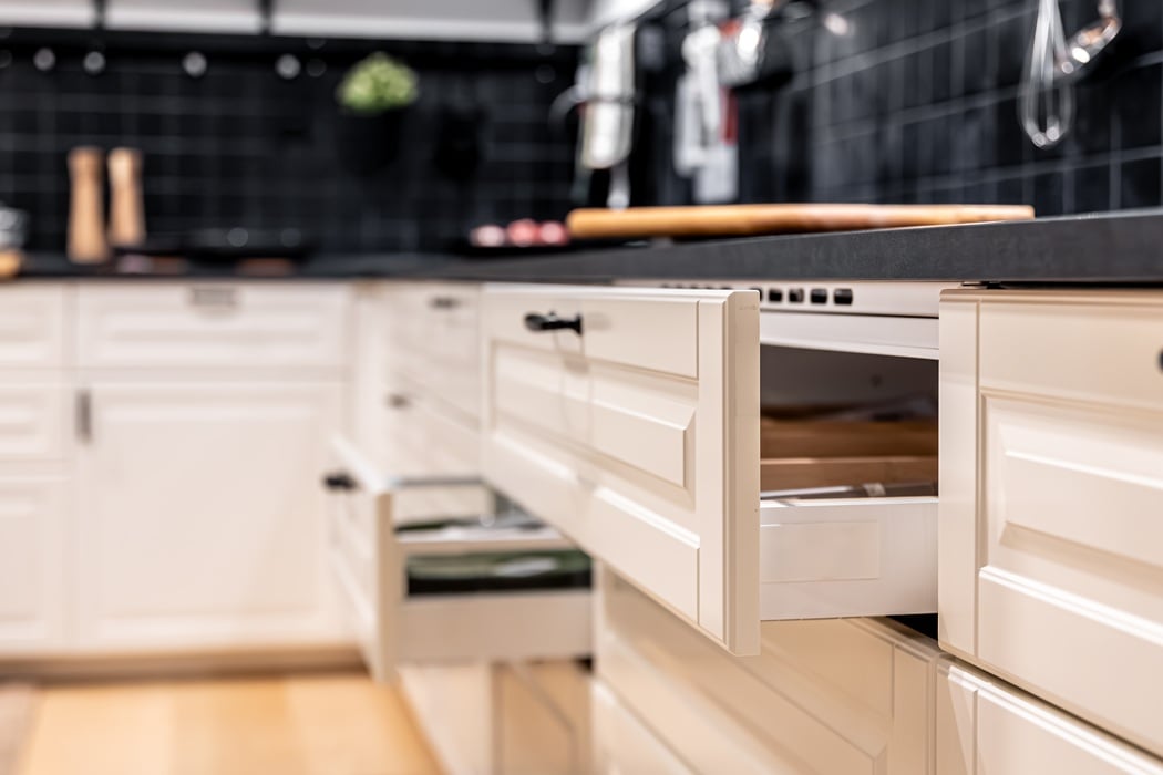
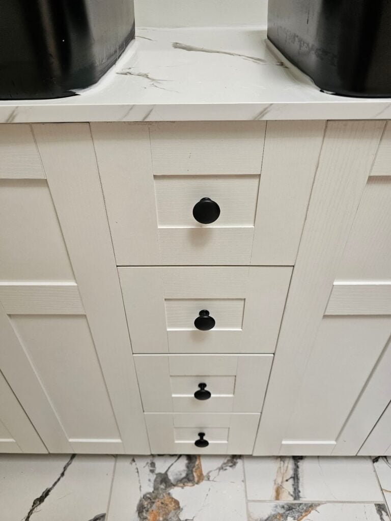
In the picture below, you can see the full height of the vanity and the adjacent wall behind the sinks and countertop. The cabinets have a somewhat timeless Shaker style facing. The doors and drawers have a continuous uninterrupted trim that wraps around the perimeter and even through a middle section at the upper half of the cabinet doors. They used a relatively minimalist or simple round button style type of cabinet door pull. These elements are somewhat contemporary and have a bit of a timeless feel to them but they’re not really modern or futuristic.
In contrast, the light fixture above the vanity has a futuristic look to it. It’s a very thin LED strip set in two different pieces with a Jetson-style swerve through the middle where the two different thin strips mount to a block on top of the electrical junction box in the wall. The other elements like the bathroom sink faucets and the towel bars have a bit of a minimalistic style sleek contour but the futuristic swerve in the LED light doesn’t really meld well, in our opinion.
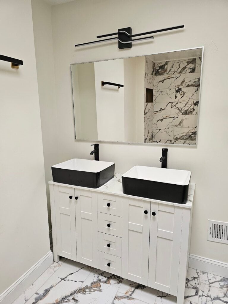
If you look closely in the picture above, you may notice that the wall facing the vanity has a finish that mimics Calacatta Gold Marble. The natural stone from which this design is based is from Italy. It comes from particular deep quarries where the natural stone is mined and harvested. The natural stone of this similar type is a metamorphic rock.
We think there’s a big clash in the styles between the slightly more traditional look of the shaker style cabinet faces and the futuristic looking vanity light and the contemporary looking sink basins and faucets. Then together all of these elements combined with the busy pattern and color of the Italian stone aesthetic makes the bathroom a bit overly complicated. All of these elements could look really good on their own in different configurations and contexts. Here though when they’re smashed together in this weird way we think it’s a bit problematic though.
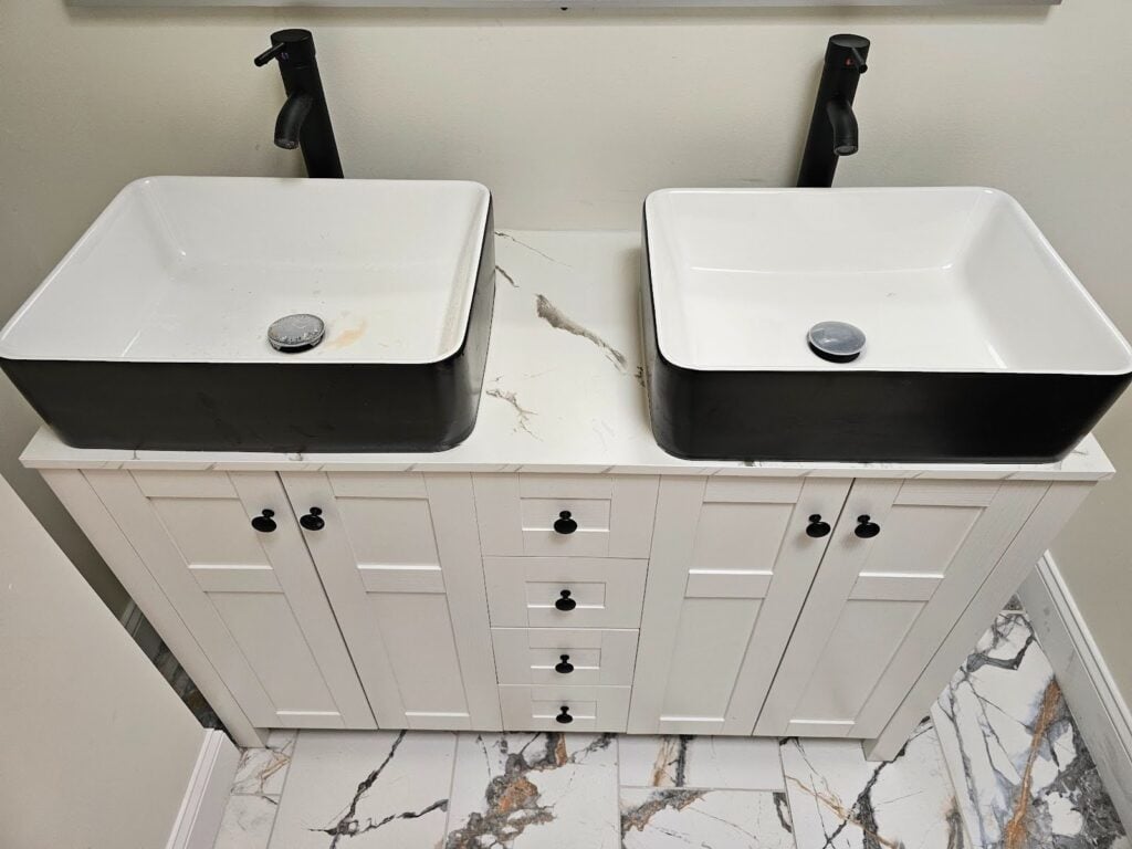
We liked that this sink is particularly wide. We think it’s helpful in bathrooms, particularly when using the sink for washing or rinsing of hair and or shaving. A relatively small sink can be difficult. The larger layout is more ergonomic and useful.
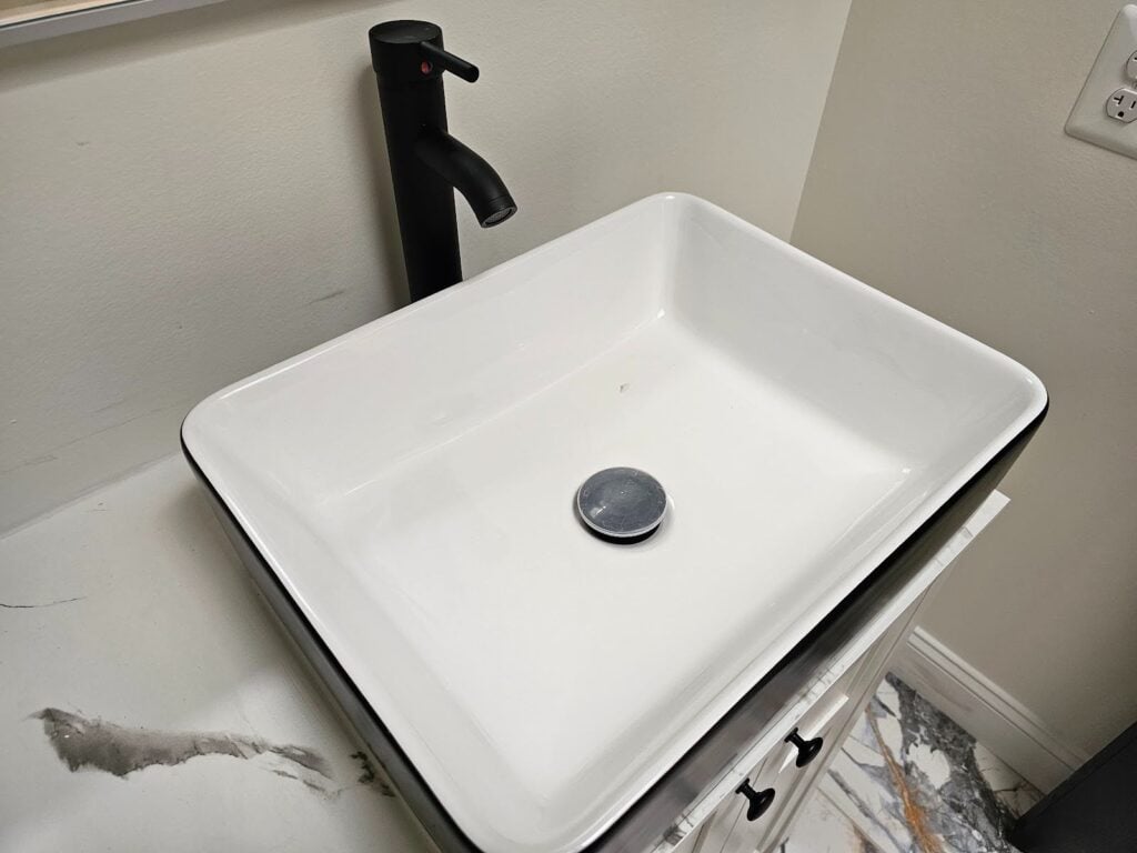
We also like that this particular countertop has a bit of space in the horizontal plane. It’s a particularly subtle detail, but if you look closely at the nosing of the countertop, you may notice that it has a pencil edge. A pencil edge is almost like a sharp angle but there’s a very tiny little chamfer when you look super close. That small chamfer has a bit of an aesthetic value because it makes the surface come together as something that doesn’t look as sharp as a pure right angle.
Functionally, it helps protect the countertop edge. When items or people are in contact with that sharp 90° corner, it can literally be sharp to the point it can hurt you physically.
The 90° corner is also fragile. Here by putting that slight and tiny chamfer into the top edge, it protects the countertop and protects people from the countertop. The design element of the 2 cm countertop edge on top of these shaker style cabinet drawers and door facings doesn’t look right. The two styles clash. One looks modern and the other one looks a bit more traditional. We do think that the shaker style can work well with a wide range of adjacent styles, but here against a more modern finish, the contemporary shaker style feels more traditional than it would in other contexts.
Dupont Kitchen & Bath Can Help
As dedicated and local DC metropolitan kitchen and bath builders and installers, we pride ourselves on turning your visions into reality. Your kitchen and bathrooms can reflect your unique style and be designed with personalized aesthetics. It can be a process from creative designs to the realization of your dream space. Specializing in kitchen and bath construction, we bring expertise and skills to every project. If you’re contemplating a renovation, upgrade, or modernization in the local market, we’re happy to be your team. Consult with us, and we can start together on a path to redefine and elevate your DC living experience.
You can visit our company website at https://dupontkitchenbathdc.com/
Here at our website you will find a simple and convenient web form that you can fill to quickly.