Table of Contents
ToggleModern Porcelain Kitchen Flooring with a Modern Concrete Aesthetic
Last week, we took a look at a tile that was made to look like concrete. There was no question that it was intended to have a concrete aesthetic because you could see an obvious aggregate illustration and other visual signs that are typical of exposed concrete. Exposed concrete is rare in many types of building constructions because in most cases concrete is intended to be a structural element that is covered before the building construction is finished. Even at both the interior and exterior, most often the concrete superstructure is hidden by all the finishes. The floor slab may be made of concrete but it’s normally under some type of wood or tile.
Even less expensive finishes like carpet or sheet vinyl could cover a concrete slab. We often think of concrete slabs as the basement, here in Washington, DC, but there’s also many high-rise buildings that have elevated concrete slab floors as well. The ceilings, in those cases, will generally drop down below the underside of the floors above and conceal the concrete slab from below. As well, even concrete shear walls or columns are normally clad or furred out to be encased with drywall or a different type of wall panel type finish. The point is, generally concrete isn’t left exposed.
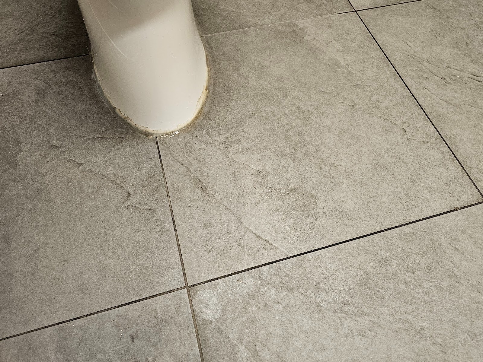
However, as we talked about last week, in recent years there’s been a bit of a revival of interest in rustic and utilitarian or brutalist type architecture. We have terms nowadays like shabby chic and retro industrial styles that are popular. The floor shown here today though is a little bit different. It still does look like concrete but it’s not clear that it was intended to replicate the aesthetic of concrete. Ceramic or porcelain elements that are made to look just like concrete or intended replicas, are often a faux type of concrete finish.
The ones shown here, in the picture below though, by comparison intended to look like a natural stone that has similar aesthetic qualities. There’s a high degree of consistency across the exposed face of the tile, more similar to a sandstone than most types of granite. Granite often will have veining and a high degree of variation, even though they might follow or have a consistent overall trend in the color or aesthetic.

Looking at the transition, at the outside edge of the room, you can see that where this tile is used in the kitchen and dining area, it transitions, towards an outdoor porch or seating area with a wood plank looking ceramic tile. In some cases, these ceramic tiles are actually labeled or sold as porcelain and there is a difference in the firing and substrate materials, but they actually perform similarly. They both have a high degree of resistance to permeation and a high level of durability.

One of the advantages of this neutral color flooring is that it works well with a variety of different finishes that might be used between a kitchen and a seating area such as the one shown here. The wood of the table legs and the table top itself are a moderately dark wood with a reddish hue. It’s a particular species of wood that is moderately dark but they’ve used a reddish color stain as well to bring out those highlights and details in the wood.
Throughout all the different types of kitchen styles that we’ve seen here on our website and in our blog section of our site, we’ve looked at several styles of cabinets and countertops. Some of the natural finish cabinets and countertops will complement or at least fit and blend well with this type of flooring. The flooring itself is relatively neutral so offers a degree of pairability with many different types of finishes. One of the most obvious types of finishes that pairs well is a monochrome dark or light, almost like black and white, at the extremes of the range.

There’s a slight range in the grout size, but we think that this is actually smaller than 3/16 of an inch, the spacers use were probably closer to 1/8 of an inch thickness. However because of the substrate, whenever dealing with moderate to large tiles, unless the subfloor is exactly perfect, it’s almost impossible for tight mortar or grout joint lines to not reflect an unevenness or lippage in the planar surface of the tile work.

We normally suggest a grout color that is slightly darker than the main field of the tile, but there are no significant dark accents in this particular range of colors and here they have used a grout line that almost blends in with the tile and it makes the tile look better because it minimizes the appearance of spacing or any discrepancy in that spacing.

It’s always better to have consistent spacing between tiles, but here, likely because of imperfections in the substrate, and having such a thin grout line, the color, being almost near matching to the color of the tile, helps hide those variations in discrepancies.

Dupont Kitchen & Bath Can Help
As dedicated and local DC metropolitan kitchen and bath builders and installers, we pride ourselves on turning your visions into reality. Your kitchen and bathrooms can reflect your unique style and be designed with personalized aesthetics. It can be a process from creative designs to the realization of your dream space. Specializing in kitchen and bath construction, we bring expertise and skills to every project. If you’re contemplating a renovation, upgrade, or modernization in the local market, we’re happy to be your team. Consult with us, and we can start together on a path to redefine and elevate your DC living experience.
You can visit our company website at https://dupontkitchenbathdc.com/
Here at our website you will find a simple and convenient web form that you can fill to contact us quickly.


